Like so many stories of creative inspiration, this one began with a shower. A broken shower, actually.
Several years ago, a couple in Portland, Ore., decided it was about time for some updates to their two-story Craftsman-style home, built in 1907. They and their two children had lived in the house for the better part of a decade, long enough for its awkward eccentricities to lose their charm and for renovation wish-list items to become imperatives — especially an out-of-commission upstairs bath that forced the family to share another one.
The homeowners had admired commercial spaces created by Jessica Helgerson, a Portland designer, so they invited her over to discuss a new bath and other upgrades they hoped to do, eventually. Right away, Ms. Helgerson identified opportunities for improvements in layout and flow that went well beyond a mere bathroom remodel. The 4,000-square-foot four-bedroom home had been “severely altered over the years,” the designer said. “At one point it was split into apartments.”
Though previous owners had restored the house to a single-family residence, a second staircase remained at the back that did little more than take up space. Ditto the phone booth at the top of the front stairs. And any decorative details had long ago been stripped away.
Ms. Helgerson and her team, including Mira Eng-Goetz, who served as the project’s lead designer, proposed a comprehensive makeover.
A couple of years passed before the owners agreed, and they eventually relocated to temporary quarters for 14 months during the renovations.

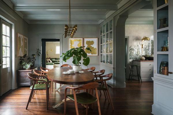
The redesign allows for easy access between the dining room and kitchen.CreditAaron Leitz
The first step was to remove the back staircase to make way for a new family room and an informal dining and project area downstairs, while expanding the children’s rooms above. The designers also reconfigured the kitchen, opening it up more to the dining room by replacing solid walls with double-sided glass cabinets, and created a generous master bath where a covered balcony had been.
Along the way, they added coffered ceilings, columns and ceiling rosettes. These and other architectural elements, Ms. Eng-Goetz said, helped “dress up a house that had lost a lot of its original charm and character.”
While the changes show respect for the home’s early 20th-century pedigree, this was not a restoration project, as no original plans or period photos exist.
“If a house has any sort of special renown, our office is apt to research it to death and really consider what that architect would have done, but this was not that,” said Ms. Helgerson, who is known for her stylishly thoughtful updates of historic spaces. “This house could be whatever it wants to be, and we felt quite free in that way, which was fun.”
The designers described what they created as an ode to the Pacific Northwest. That meant lots of rich wood, including Western walnut countertops and Oregon white oak floors; leafy wall patterns; and a lush, moody palette dominated by mossy greens and cloudy grays. (Notably, there are a few choice hits of pink, adding “a little bit of dawn or dusk,” as Ms. Helgerson put it.)
Located on a tree-lined block at the edge of Portland’s Northwest Alphabet district, the house isn’t far from 5,200-acre Forest Park, which is crisscrossed with hiking trails and home to firs, cedars, hemlocks and ferns. The family spends a lot of time in the park and embraced the décor as an extension of the natural surroundings.
The ultimate expression of that theme — and the home’s showstopping moment — comes in the kitchen. There, the walls are clad in hundreds of shimmering celadon tiles, hand-painted by Ms. Eng-Goetz with wispy, curling ferns that scroll across the space, even the integrated refrigerator.
“Sword ferns seemed like a perfect muse for this project,” she said. “I love their strong sculptural shapes, and I’ve certainly tromped through them many times while mushroom hunting in Oregon and Washington.”
Tiling the refrigerator was also a rare “feat of engineering,” Ms. Helgerson noted. “I feel like Mira’s ferns are the most beautiful thing our office has ever done, and I’m grateful to the clients for letting us do something so weird and wonderful.”
Botanical patterns also enliven the pink-hued powder room and the second-floor study, where the walls are papered in an exuberant Arts & Crafts floral print and the ceiling and moldings are painted dark sage green. Throughout the house, the furniture is lean and modern, with soft curving forms, monochrome upholstery — a Helgerson signature — and, again, plenty of wood. The lighting, mostly brass and contemporary in spirit, is by international design studios like Apparatus, Areti and Neri & Hu.
Because a four-story apartment building stands immediately next door, light and views are compromised, particularly at the center of the house, which is much deeper than it is wide. The designers used reflective surfaces, including smoked-mirror walls in the stairwell and a quartet of gold-leaf artworks by Yoshihiro Kitai in the dining room, to bounce light around the spaces. They also opted for sheer curtains to let light in while masking the view.
Though the children, now teenagers, spend an increasing amount of time in the basement (not part of the renovation), everyone enjoys piling onto the new family room’s U-shaped sofa. Built-in sofas like this are another Helgerson specialty, and she said her firm has learned to make them “more and more squishy and comfortable.”
Being enveloped by the plush cushions and throw pillows in verdant hues of soft velvet, within this forest-inspired home, the owners might almost imagine they’re lying on a bed of moss — one that is very stylish and exceptionally cozy.


