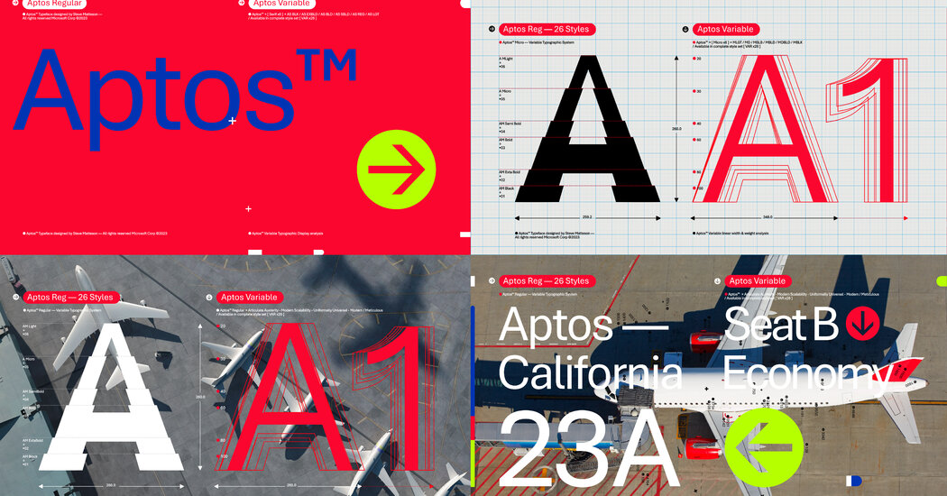
When you read — a book, a traffic sign, a billboard, this article — how much do you really notice the letters? If you’re like most people, the answer is probably not at all.
But even if you don’t really notice them, you might sense it if something has subtly changed. That’s a feeling some people have had in recent weeks when they turn on their Microsoft Word programs.
After 17 years of Calibri as Word’s default typeface, many users suddenly found themselves typing in a new typeface called Aptos. The change is also affecting the look of PowerPoint, Outlook and Excel.
Letters are letters, but for designers and typography fans, they matter a lot.
Why the change?
“We wanted to bring something new and fresh that really was designed natively for the sort of modern era of computing,” said Jon Friedman, the company’s corporate vice president for design and research, who led the effort.
(Technically Aptos and Calibri are typefaces, while a “font” refers to a particular face or size, like italics or boldface. But in practice, “font” is often used as a synonym for “typeface,” including by Microsoft employees interviewed for this article.)
The big divide in the world of typeface is between serif, or letters with small lines or tails attached to their edges, and sans serif, letters without those lines that have a smoother look.


