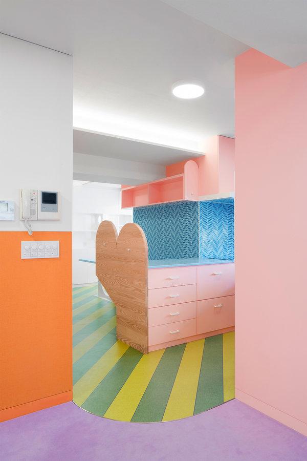
Orange, mango, strawberry, lime. If an apartment could be said to be bursting with fruit flavor it would be this three-bedroom, two-bathroom apartment in Tokyo’s Nagatacho district, renovated by Adam Nathaniel Furman, a British architectural designer, for a pair of very adventurous clients over the past two years.
Mr. Furman’s clients, a mixed Japanese-expat retired couple, who regularly host guests from abroad, had owned the 1,700 square-foot apartment since the 1980s, just after the building was completed. The existing layout was dark and self-contained, with small rooms off a long corridor and ceiling heights of under eight feet.
Mr. Furman, 36, whose maternal grandmother is Japanese, rearranged the plan to create an entrance vestibule and short hallway leading past twinned single bedrooms, after which the apartment opens up into a large living room that is united with the kitchen and eat-in island. The separate master bedroom and bath are off the dining area, creating flexibility should the owners want to rent out part or all of the apartment. The line between living and dining is marked by a curve where lavender carpet meets green-striped vinyl flooring.
Once the hung ceiling was down, beams, ducts and other guts of the building were enclosed in tight cavities that were then covered in textured white wallpaper to keep the increased height. Mr. Furman ended the wall color at a uniform distance of just over four feet from the floor. “The white doesn’t hide it,” he said about the ceiling’s irregularities, “but the color draws your eye somewhere else.”

The line between living and dining is marked by a curve where lavender carpet meets green-striped vinyl flooring.CreditJan Vranovsky
“Originally they were referring to it as the ‘bubble gum flat,’” Mr. Furman noted about the clients, who declined to be interviewed for this article. “Then they switched to ‘watermelon.’ You can see the hints of green, the stripes, the warm tones that turn into meaty, juicy pinks.”
Many of the client-architect discussions devolved into conversations about senses, tastes and food, and Mr. Furman spent days with the couple shopping for materials. “I don’t see how I could get clients more actively participating in the joy of designing,” he said.
The kitchen and bathroom counters, made from a semi-translucent artificial marble manufactured by LG Hi-Macs, was one of those sensual moments: “If you put that in front of people who love colors, they will fall in love,” Mr. Furman said. The yellow bathroom fixtures were a harder sell. The faucets, a Danish classic designed by Arne Jacobsen in 1968 for Vola, are one of few selections for the apartment not sourced in Japan. “I spent quite a bit of time trying to get them to agree to that,” Mr. Furman said, “I was very sure of myself.”
While most of the apartment’s colors are somewhere between a pastel and a muted bright, the faucets came in hot — “a bit of a Tabasco thrown on.” Luckily Japanese manufacturers are more liberal with rainbow hues than American or British ones; the matching heated towel racks are from a standard catalog, as are the peachy toilets. “In the U.K. it is so hard to find colored sinks and toilets, they tend to be vintage from the 1970s,” he said. These, by Lixil, are more affordable than Toto, and come in a range of Easter egg tones.
While Mr. Furman is drawn to artificial materials like vinyl (the kitchen floor) and melamine (the dotted and arched doors), his clients wanted some natural elements as well. The connected kitchen-living-dining rooms revolve around a large custom-made cabinet built from spruce, while the variegated aqua backsplash tile is from Nagoya Mosaic.
“I wanted to find a place that produced ceramics that have a wonkiness to them that offsets the hard surfaces,” Mr. Furman said. He gained money in the budget for the bespoke cabinet by saving on the bath-and-shower units, which came off a truck as one integrated piece.
All those colors, all that jazz — not everyone wants to live in a sweet or spice shop year-round, so Mr. Furman has not had many opportunities to design permanent spaces. “A lot of people approach me and then see my portfolio and then run away screaming,” he said.
After working for architecture firms for eight years, he went out on his own two years ago and has had the most success designing temporary installations. These include Gateways, a series of ceramic-tile arches sponsored by Turkish Ceramics and erected for the 2017 London Design Festival, as well as animated architectural logos for Britain’s ITV network, on the air in March 2019.
In published writing including “Revisiting Postmodernism,” a book co-authored with his former employer the British postmodernist architect Sir Terry Farrell (RIBA Publishing, 2017), Mr. Furman has argued for a more joyous and sensual approach to architecture, as well as the need to preserve a sometimes-villainized moment in late 20th century building. In an essay in the Architectural Review on contemporary British architecture he compared the brick-dominated palette to natural makeup — artificial but unseen. In Nagatacho, he has created the opposite effect: There’s something to see everywhere you look.
What kind of client is comfortable living inside a melon? “They are very eccentric, not in terms of dress or outward appearance; they just don’t accept norms,” he said. “They enjoy finding new things to like between them.”


