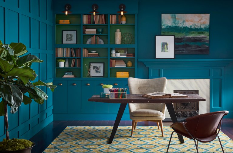
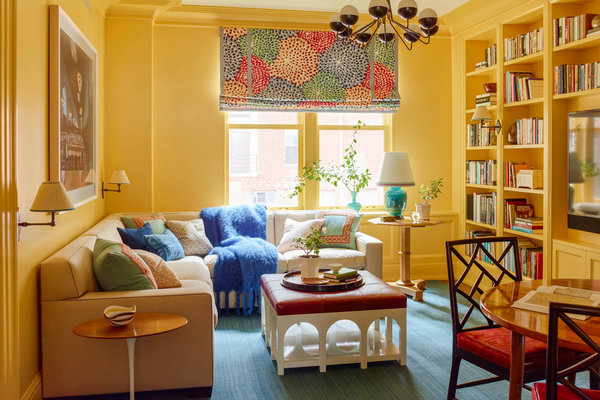
By the time the workers arrived to paint my living and dining rooms, I thought I had it all figured out. I’d spent a solid month sampling colors, so my walls now looked like some strange art project, riddled with stripes of suspiciously similar hues.
I’d built intricate Pinterest boards, full of endless variations for the dining room, which I planned to paint a saturated teal. I’d read blog posts and articles in design magazines about the best whites for a living room. I followed Instagram influencers with their professional photographs of gorgeously staged rooms with walls that looked, well, white. I settled on two Benjamin Moore colors: Simply White for the living room and, for the dining room, North Sea Green, which, despite its name, is not green.
I was ready to go. The painter dutifully noted my choices on his clipboard and then asked, “What about the trim?”
What about the trim? Wouldn’t we paint it the white that I’d worked so hard to find? The influencers all said it was a great color.
Then he explained that I might want contrast for the crown molding, windows, door frames and ceiling so my white walls would pop. So, as one does in these moments, I flew into a panic.
I frantically texted my friend, Debra Marcoux, the director of Kathryn Markel Fine Arts, a gallery in Chelsea. She sold art; she’d understand color. “Simply White is not a pure white,” she responded. “It’s got yellow in it.”
Yellow? But the website described it as “fresh as the first snowfall.” And we all know that the first snowfall should not be yellow. Had all this work been for nothing? I felt a sense of dread creep in. Despite my efforts, the truth was out: I had no idea what I was doing and I was destined to make a terrible decision.
My reaction, it turns out, is not uncommon. When faced with too many options, a person is likely to feel overloaded and ultimately disappointed with the end result. For all the talk about freedom of choice, we actually fare better when we have less of it.
“What we’re asking is: Is this the best I could do? And when the choice set is large, the answer is always no,” said Barry Schwartz, a visiting professor at the University of California, Berkeley and the author of “The Paradox of Choice: Why More Is Less.” “Not only do you have a harder time choosing, you then beat yourself up when there’s no reason to.”
This is one reason people like shopping at Trader Joe’s. It’s not because we can’t get enough of the Cookie Butter (well, maybe that’s part of it), it’s because when we walk into Trader Joe’s we don’t have to wonder if a better deal on some lesser brand of spreadable cookie is one shelf down, because it isn’t — there’s just their Cookie Butter. “It’s not torture to buy your groceries” at Trader Joe’s, Dr. Schwartz said.
Do you know what is torture? Picking out paint color.
Not only do you have to choose a general color — teal! — you then have to zero in on infinite variables, sifting through Photoshopped images to figure out what would actually work in your real-life home. Will the undertones make the room look green? What about the lighting? The furniture? Type “Teal Paint” into Pinterest and the results send you swirling to walls, furniture, swatches and a teal-painted sign that says “Just Relax.”
With 3,500 colors by Benjamin Moore alone, where do you even begin? The experts say your search shouldn’t start with the color wheel. Instead, you should “seek inspiration,” said Benjamin Moore color and design expert Andrea Magno. “Start by grabbing anything that appeals to you — anything that makes you stop for more than a couple seconds.”
Once you’re inspired, then set out to find that hue. Color descriptions, much like those for bottles of wine, are basically word salad. Consider Hale Navy, a color I chose for the inside of my front door. As Benjamin Moore describes it, “this deeply saturated shade of navy blue evokes rich maritime traditions and storied exploits at sea.” Don’t get me wrong, I love the color, but what does that description even mean? I rarely look at my front door and think, “Moby Dick.” Instead, I usually think: Should I have gone with Gentleman’s Gray instead?
“Those choices that people are making on the internet can look pretty dull in real life,” said Eve Ashcraft, a Manhattan color specialist and the author of “The Right Color.” Sure, it can help guide you, but “it doesn’t allow you to pick the right color for the wall.”
Online brands have caught on to this conundrum and are starting to do the choosing for us. They call it “curated.” Rather than stare at a wall of overpriced eyeglass frames, you can buy the ones Warby Parker sells and assume you’ll look good enough. The same goes for mattresses, suitcases, razors and makeup.
So why not paint, too? Consider Clare and Backdrop, two online paint brands that started last year and are betting that we’ll tire of the quest for the perfect color and accept the roughly 50 they’ve selected for us. Want white? Clare offers four. Backdrop, five. The names are clever and the descriptions pointed. Backdrop has a red called “Lipstick on the Mirror” and Clare offers a “Matcha Latte” green.
Last month, Clare added a new color to its palette, a pale blue called Frozen (get it, like the Disney movie). Guess how it chose the new addition? Crowdsourcing. Followers on social media first voted on their favorite color from a choice of six. They then voted on the name. Nicole Gibbons, the founder of Clare, preferred one of the runners-up, an army green. But she now plans to paint her kitchen Frozen, which the website describes as a “cool hue” that “you’ll never want to let go.”
As for my white walls, my friend Ms. Marcoux assured me that a yellow undertone wasn’t bad. I just needed a cooler white for the trim. She suggested one she knew well. “It’ll go nicely with your teal, too,” she said.
I decided she knew what she was talking about and had the painter put a sample on the trim. It looked like white, but slightly different from the other white. It looked great. I went with it and, surprisingly, never doubted my choice.


