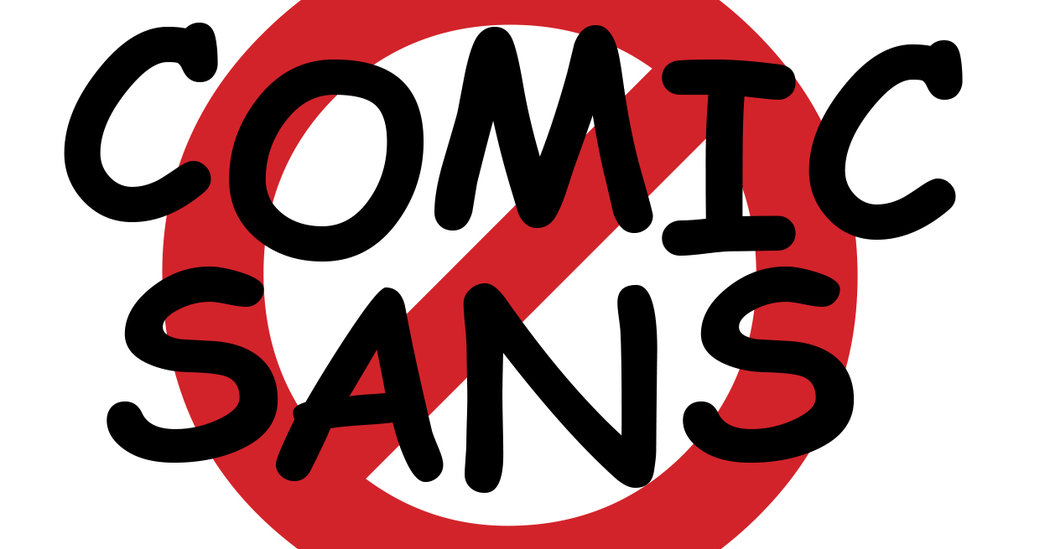
Vincent Connare, the creator of Comic Sans, has something to say about his Frankenstein-like font: “If you love Comic Sans you don’t know much about typography. And if you hate Comic Sans you need a new hobby.”
Of all the things people love to hate — Mondays, the Kardashians, candy corn, Nickelback — few evoke the scorn and indignation of what Mr. Connare affectionately calls “the Justin Bieber of fonts.” The depth of the internet’s distaste for Comic Sans was on full display this week, when an attorney representing two of Rudy Giuliani’s associates informed Congress that his clients wouldn’t comply with the impeachment inquiry demands, with a letter printed in that widely derided type.
Here’s the letter (yes it’s Comic Sans) indicating that Rudy Giuliani’s associates will not be appearing or providing documents this week.
Attorney John Dowd (Trump’s former lawyer) argues the timeframe is too short and info could be attorney-client privileged. pic.twitter.com/3ytCecrPHv
— Kyle Cheney (@kyledcheney) October 7, 2019
The font quickly trended on Twitter. At least one user recommended the lawyer be disbarred. But Mr. Connare said he believed that the attorney knew what he was doing by using a divisive font. Where legal documents are often written in Courier, Comic Sans scoffs at what’s politically correct.
“It’s like, ‘Not only am I going to refuse to submit these documents, but I’m going to use a typeface that doesn’t submit to the solemnity of the law, and Congress and public institutions,” said Michael Bierut, a partner at the design firm Pentagram. “Or maybe he just likes Comic Sans. It’s hard to say. Few typefaces are this freighted with public opinion.”
But strongly held beliefs can be unifying. Holly Combs, 43, fell in love with her husband, David Combs, 20 years ago over their shared contempt for Comic Sans.
“He told me it was his goal to learn every typeface, and I was like, ‘That’s so sexy,’” Ms. Combs said. When a local art gallery gave her a work assignment in Comic Sans, the pair bonded over their mutual distaste for what they deemed the “least thoughtful” font. “He was like, ‘What if we ban Comic Sans?’ and I said, ‘Wow, we’re spending the rest of our lives together.’”
The pair went so far as to publish an anti-Comic Sans manifesto online and began selling a line of products. They affixed stickers to walls and billboards around their hometown boasting the slogan: “Ban Comic Sans.”
Born in October 1994, Comic Sans would now be eligible for its quarter-life crisis — if it hadn’t spent its first 25 years in an identity crisis. The idea for the font came when Mr. Connare was helping to develop an easy-to-use operating system for Microsoft. While sketching a talk bubble for “a cute little yellow dog,” Mr. Connare had an epiphany: “Dogs don’t talk in Times New Roman!” He decided the program needed a new font, zanier and more childlike, for which he took inspiration from comic books and graphic novels.
From its inception, the font attracted eye rolls and outright pitchfork attacks. Mr. Connare’s boss, Bob Norton, wasn’t a fan of it and axed it from the ill-fated program, called Microsoft Bob. But the font lived on in a Windows 95 Plus! pack. Paige Shelton, author of the mystery “Comic Sans Murder,” set in a fictional typewriter repair shop, said that when the font was released “all Helvetica broke loose.”
Comic Sans is what Ms. Shelton calls “a fun-times font,” manspreading across paper in strokes thicker than fair Cambria or no-nonsense Garamond. (Mr. Bierut said Helvetica, by contrast, is a “a call from H.R.”) The spacing, or kerning, between its letters is uneven because it wasn’t designed for print.
To type traditionalists, use of the font can signify frivolity or even disrespect. The website Comic Sans Criminal allows people to report its inappropriate uses (see: a sex offender registry, a doctor’s diagnosis). In 2010, a Twitter employee shared that the site’s two most reliable sources of traffic are complaints about airlines and Comic Sans.
Mr. Bierut said that Comic Sans has long been “the default punch line in the design community.” Because it’s meant to simulate the handwriting process, it can come off as inauthentic, he explained, like a packaged cookie when you expected homemade. It is “willfully idiosyncratic,” with its crooked lines and unevenly distributed weight.
“It reads like a Mickey Mouse cartoonish voice,” said Mr. Bierut. “It has this weird sense of dislocation.”
But the Comic Sans hatred was never universal. Ty, the maker of Beanie Babies, used it. So did Electronic Arts Games, creator of The Sims. Scientists at CERN used the font in a landmark presentation about the Higgs boson particle, and Dan Gilbert, the owner of the Cleveland Cavaliers, used it to thank LeBron James for his service.
It is also recommended by the British Dyslexia Association. In a post on its website, the American Institute of Graphic Arts said Comic Sans helps readers with disabilities because of its “character disambiguation” and “variation in letter heights.”
In May, Mr. Combs decided that the “Ban Comic Sans” project had “gotten out of hand” and changed his Facebook group’s name to “Use Comic Sans.” “It’s gotten to be so bad that it’s almost cool again,” he said. (His wife disagrees.)
Mr. Connare said he’s used the font he created once in the last two decades, to write a letter of complaint about his broadband. The company gave him a £10 refund. “It certainly gets you attention,” he said.


