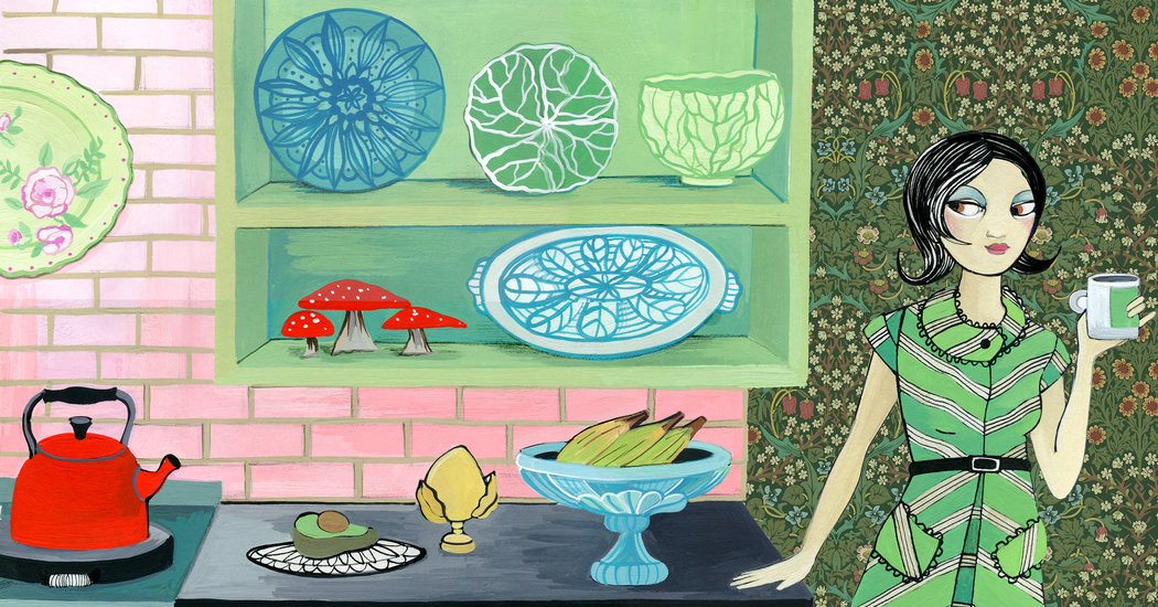
Remember your grandmother’s avocado-green kitchen? It could soon be yours. Or maybe it’ll be pink, mauve, emerald green or buttercup. Anything but white, because the revolt against the white kitchen has begun.
Last November, the cover of Elle Decor featured a Steven Gambrel-designed kitchen awash in a shiny turquoise — even the ceiling gleamed like an iridescent underwater wonderland. On Pinterest between November 2018 and November 2019, searches for dark green cabinets jumped 367 percent, plum kitchens went up 107 percent and pink kitchen walls spiked 121 percent.
For decades now, cabinets have been relegated to white, brown or maybe black, and it’s been even longer since appliances were allowed to be anything but stainless steel. But the Instagram kitchen — invariably a clean backdrop of basic Shaker cabinets, simple subway backsplashes and marble countertops — finally has some competition.
Jenny Dina Kirschner, an interior designer in New York, recently painted the cabinets pink for a client in Long Island, giving the room a decidedly ’80s vibe somewhere between mauve and millennial pink. The color picked up the pinkish tones in the Calacatta Vagli marble countertop.
“We’re starting to see more daring use of color,” Ms. Kirschner said. “It’s a rebellion against the white kitchen.”
Breaking the mold is risky when 43 percent of homeowners choose white cabinets and a third choose white countertops, according to a 2019 Houzz report. Try something bolder than wood cabinets or black soapstone countertops and you might fail. Unlike an unfortunate coat of paint on the living room walls, the wrong choice of cabinetry could cost a homeowner tens of thousands of dollars. And money aside, it’s not easy to rip out that chartreuse backsplash if you later regret it.
Yet cracks in the color-free facade are emerging. Between 2018 and 2019, BHG.com consumer insights found a 115 percent spike in interest in cabinet paint trends and a 10 percent increase in interest in colorful kitchen cabinetry. And from March 2018 to March 2019, interest in blue and green for paint and home décor rose 50 percent. Navy cabinets have become increasingly popular along with two-toned ones, with choices like blue for the lower ones and blond wood for the uppers. Greens of all shades have been nudging their way onto the stage, too, appearing as emerald cabinetry, avocado backsplashes and sage pendants.
In a throwback to the 1970s, the age of wacky colored appliances is also back. Want a retro fridge? Big Chill carries them in colors like beach blue, cherry red and pink lemonade. The appliance company BlueStar offers hundreds of color options, as well as custom colors for its products, letting customers personalize down to the color of the doors, trim and dials. Have a specific shade of purple in mind for your oven? Dacor can match a swatch you provide to the color of its appliances.
“Anything goes these days,” said Gideon Mendelson, an interior designer in Manhattan. He is currently designing a yellow kitchen for a couple on the North Fork of Long Island, which he described as “a sophisticated buttercup. It’s not going to be sweet and cutesy. It’s not quite mustard. It’s happier than that.”
Who doesn’t want a happy kitchen? With the world so dreary, a little yellow can go a long way. In these uncertain times, we’re drawn to colors that don’t need to be impeccable, that can hide the messiness of life. “There’s a sense of energy and nourishment in bright colors,” said Ingrid Fetell Lee, the author of “Joyful: The Surprising Power of Ordinary Things to Create Extraordinary Happiness.”
Alessandra Wood, the vice president of style for Modsy, an online interior-design service, told me that homeowners are looking for comfort and coziness in design choices, so why not our kitchens, too? “In this really unstable world, we are looking for anything that makes us feel comfortable, and we are definitely turning to our homes to do that,” she said.
Just look at the color Pantone chose for its color of the year: classic blue, because it “highlights our desire for a dependable and stable foundation.” Paint companies Sherwin-Williams and PPG also ushered in the new decade with blue as their picks of the year in a collective nod to what might soon be our new neutral — call it bluetral.
We’re also living in our homes differently. After decades of relentless moving, Americans are moving at the lowest rates since the U.S. census began tracking our mobility, with fewer than 10 percent of Americans moving between 2018 and 2019. Baby boomers are aging in place and millennials, facing rising housing costs and stagnating wages, are less likely to house hop. With no plans to stake a “for sale” sign in the front yard, why commit to the safe and listless colors of a staged house?
Greige, that dreary hue that is neither gray nor beige, but took over our homes for over a decade, is decidedly out. The relentlessly white kitchen may be next. It made a lot of sense in the era of house flipping. White looks clean and is unlikely to offend a potential buyer. Who hates white? And if your home is perpetually one renovation away from its next open house, white is a natural go-to color. It’s a kitchen designed for future buyers, not the specific tastes of the current inhabitants.
But let’s face it: White looks clean only when it is clean. The rest of the time, it is not the most practical color for a room that regularly gets splashed with marinara sauce. There is something to be said for a little color to hide the imperfections.
“We’re living in our spaces longer, so there’s an extra level of consideration that people are giving to them,” Ms. Wood said. “We’re thinking, ‘How do I make this space into a space that I really feel comfortable in?’”
So if there is no buyer on the horizon, if the kitchen remodel is just for you, the view widens. Why not wash the whole room in turquoise? It doesn’t really matter what some fictional buyer might think. You can be you and paint the cabinets pink.
For weekly email updates on residential real estate news, sign up here. Follow us on Twitter: @nytrealestate.


