This article is part of our November Design special section, which focuses on style, function and form in the workplace.
In Nashville, a surging economy has led to a recent construction boom, with cranes dotting the skyline. And the city’s built environment has always been subject to such churn.
“We’ve never had that deep stock of old buildings that other cities enjoy,” said David Bailey, a partner in Hastings Architecture, one of the city’s best-known firms.
But Mr. Bailey and his colleagues have done their part to retain some of Nashville’s history, in an adaptive reuse project that makes preservation seem forward-thinking indeed.
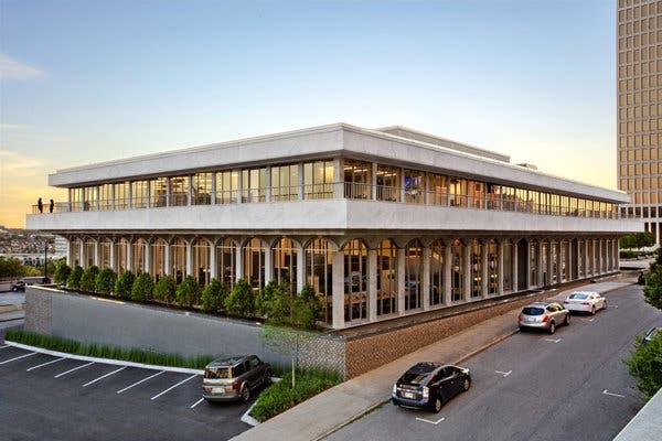
Hastings took a 1966 modernist structure that was once the Nashville Public Library’s main branch and turned it into a striking headquarters for its firm of 75 employees, which specializes in commercial and institutional architecture. The project was finished in June.
The two-story building, designed by the architect Bruce Crabtree, is clad in white Cherokee marble and defined by long colonnades of arched windows, evoking other landmarks of its era, like Lincoln Center in New York and the Dorothy Chandler Pavilion in Los Angeles. Its downtown site is central, close to the Tennessee State Capitol.

When Hastings bought the structure in 2017, it had sat empty since 2001, when the library moved two blocks away to a structure designed by Robert A.M. Stern.
“This whole project was in keeping with who we are as a business,” said Dave Powell, another partner in the firm. “It’s all about community.”
He added, “This building was meaningful to anyone in the city because of its history and its place in the urban fabric.”
The firm’s previous projects include a renovation and expansion of the Ryman Auditorium and the designs of the Thompson Nashville hotel and the Metropolitan Nashville Police Department headquarters.
Originally, another of the firm’s partners, William Hastings, was talking with a nonprofit about taking over the old library, but the plan fell through.
“He said, ‘This would be a pretty cool space for us,’” Mr. Powell recalled. “But we thought, that’s a long shot, a pipe dream.”
In particular, the 16-foot-tall windows — part of curtain walls that were among Nashville’s earliest examples of that modern form — drew them in.
“It’s on a high point in the city topographically, so it gives amazing views,” Mr. Powell said.
Hastings purchased the building for $4 million and took a practical approach to divvying up the space. The southern side of the building became a double-height, open plan for the firm’s studio.
Hastings didn’t claim all 42,000 square feet for themselves. Their offices occupy 24,000 square feet, with the remainder divided between two tenants on the north side of the building.
And in keeping with the theme of community, the firm also carved out a 1,500-square-foot room called the Athenaeum, for local nonprofits and other groups to use, free of charge. It seats 100 people.
As with many older buildings, there were challenges that could only be found over time.
“Shortly after we bought the building, it flooded,” Mr. Bailey said. “It had six feet of water — and all the electrical equipment was down there.”
Some 200 of the building’s exterior marble panels, about two-thirds of the total, had to be replaced, but the firm was able to go back to the original Georgia quarry for more.
“We were so excited about buying the building that we didn’t see all these issues,” Mr. Bailey added, chuckling.
During the renovation, everything was done so that “the original structure was the star of the show,” Mr. Powell said.
Most of the arched windows were replaced with modern, high-performance glass.
Inside, walls, columns and floors were stripped down to the concrete, and all the new materials hewed to a strict palette of gray, black and white.
“The one exception was new walnut trim, since some of the original interior had walnut,” Mr. Powell said. “Where we could, we left it, but we added some too.” Some of the original walnut doors were turned into tabletops and countertops. And the cafe challenged the severe design orthodoxy with black globe-shaped lights by the London designer Tom Dixon.
“The driver of what we do is telling a story with architecture,” Mr. Powell said. “We wanted to tell the story of the library, without being too ‘on the nose.’”
A subtle touch involved the pendant lights over the main studio area, hung from ceilings that are 21 feet tall. Though placed diagonally in relation to the rows of desks below, their orientation honors the location of the library’s original book stacks.
The whole project took the better part of two years and cost $15 million, including the purchase. “We knew it was a big investment, but we had to do it the right way,” Mr. Bailey said.
Part of the payoff from the renovation is its effect on current and prospective clients.
“There’s a multilayered wow factor here,” Mr. Powell said. “People are blown away by the sheer volume.”


