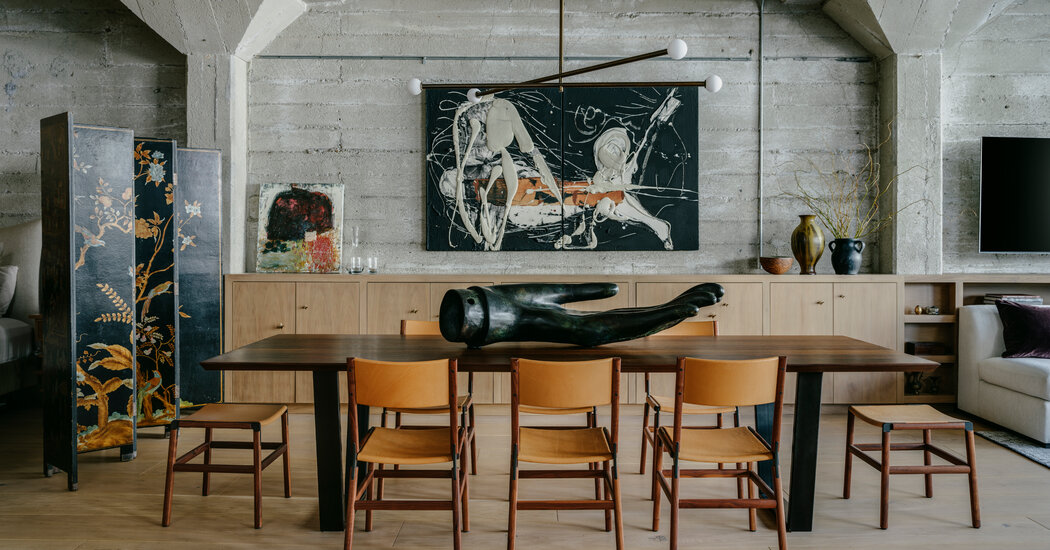
Martha Hill, a real estate agent in Oakland, Calif., was merely keeping on top of new listings in 2019 when she spotted a remarkable loft about to go on the market.
“I happened to catch it online the night before, and knew I had to make a beeline to see it, because it looked so cool,” said Ms. Hill, 58, who was born and raised in Oakland, and had lived in many parts of the city.
When she arrived at the loft, in a former ironworks in Jack London Square, she wasn’t disappointed. “It’s large, it’s symmetrical, and it’s not one of those conversions where they over-designed funny angles and mezzanines into it,” she said. “It’s just a big, open square with steel-framed windows and concrete pillars throughout.”
Ms. Hill found the simplicity deeply appealing and saw the loft as something of a 1,500-square-foot blank slate where she could create her ideal home. She knew from professional experience that it would sell quickly, so she moved decisively.
The loft was listed for $725,000, and she offered $800,000. “I gave him enough that he was convinced he wouldn’t get more from the competition,” she said of the seller. “But little enough that I was sure I wasn’t overpaying by too terribly much.”
The strategy worked, and she closed on the property that August. Then she began making plans to change it.
The building had been converted to condominiums in 2000, and the interior finishes had a bit too much of a heavy-handed industrial vibe for her liking, including closet doors made from galvanized sheet metal, an island with a butcher-block counter supported by steel pipes and exposed structural pillars highlighted with bright red paint.
“You could almost imagine a coffee maker made out of bike gadgets in there — they had really gone for the industrial,” Ms. Hill said. She wanted to preserve the rugged shell of the space, but “make it very sophisticated.”
Specifically, she hoped the interior would feel as calm and inviting as the lobbies of upscale hotels she had visited in nearby Sonoma County. “I wanted to create that sort of spalike feel, and get to enjoy it every day,” she said.
First, she got rid of the monstrous furnace on full view in a corner of the living space and replaced it with a streamlined mini split. She covered the thin-strip wood flooring with new 12-inch-wide white-oak boards.
Then, to help realize her larger vision, she turned to Lane McNab, a San Francisco-based interior designer whose work she had admired at a friend’s house. “I didn’t want to fall into the trap of having an idea in the bedroom, an idea in the dining room, an idea in the living room and an idea in the kitchen, only to have a big, open space with four ideas competing for attention,” Ms. Hill said. “And I had seen Lane’s work, and how easily and softly she captured one idea and could flow it through space.”
After meeting with Ms. Hill, Ms. McNab knew exactly what to do. “We wanted it to feel high-end and luxurious, but to still respect the rawness of the space, with its concrete walls and exposed pipes,” Ms. McNab said.
That called for employing a simple palette of natural materials and understated colors, she added: “We didn’t want anything lacquered or faux or highly polished.”
In the sleeping area, Ms. McNab replaced the sheet-metal closet doors with a wall of bleached walnut built-ins. She demolished a drywall partition that partially separated the sleeping area from the dining area, and installed an antique folding screen (leaving Ms. Hill the option of adding a steel-and-glass partition in the future).
Another bank of bleached walnut cabinetry runs the length of the dining area and into the living area, before terminating at the windows. In the dining area, the cabinet doors have an asymmetrical arrangement of pulls resembling abstract butterflies, which Ms. McNab sculpted in clay and then had cast in bronze. In the living area, the unit transitions to open shelves that run behind a large, custom-designed U-shaped sofa. Overhead, she installed cable-based lighting that adds illumination without requiring more conduit on the ceiling.
On the other side of the loft, they replaced the kitchen with help from Lisa Cannelora, the owner of Cucina, a kitchen-design company based in Alameda, Calif., who improved the spatial flow and added a larger island with a Neolith counter illuminated by brass-and-walnut Arc pendant lamps from Allied Maker. That space runs into an open office by the windows, where they painted the red structural members black, so they no longer command as much attention.
Ms. Hill moved into the loft in January 2020, after the floors were replaced and the kitchen was installed, and lived there through the rest of the construction. She waited until this year to renovate the bathroom, which brought the total cost up to about $180,000.
Now, “one of my great joys is literally to sit on the couch and look through a magazine or read a book,” she said. “It’s the thing you want to do on vacation but are too busy wine tasting, riding your bike or shopping to do. It’s my sanctuary.”
For weekly email updates on residential real estate news, sign up here. Follow us on Twitter: @nytrealestate.


